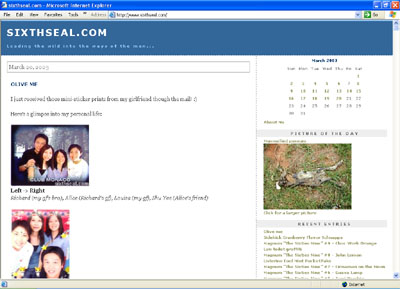
The old layout
I’ve did some modifications to the Cascading Style Sheet tonight for
a slightly new layout. Once you get the hang of CSS it’s not that hard
to fiddle around with, it’s just another scripting language. Anyway,
I’ve tested it against 800×600 resolutions and it works. That’s the
lowest it’ll go though, so my apologies to people who are using lower
resolutions like 640×480. Supporting that resolution would limit me to
only 300×225 pictures and sometimes I want 450×338 pictures to
highlight certain events.
Anyway, I also did some color scheme changes for a more coherent design as advised by my helpful image consultant
[blogspot.com]. 🙂 The most visible change is the new banner above.
I’ve always wanted to have a banner or logo of some sort, and this one
goes back to the roots of the domain. When I bought this domain, it was
meant to reflect this passage in the scripture:
And I beheld when he had opened the sixth seal, and, lo, there
was a great earthquake; and the sun became black as sackcloth of hair,
and the moon became as blood;
And the stars of heaven fell unto the earth, even as a fig tree casteth her untimely figs, when she is shaken of a mighty wind.
And the heaven departed as a scroll when it is rolled together; and every mountain and island were moved out of their places.
And the kings of the earth, and the great men, and the rich men, and
the chief captains, and the mighty men, and every bondman, and every
free man, hid themselves in the dens and in the rocks of the mountains;
And said to the mountains and rocks, Fall on us, and hide us from the
face of him that sitteth on the throne, and from the wrath of the Lamb:
For the great day of his wrath is come; and who shall be able to stand?
Revelation 6:12-17
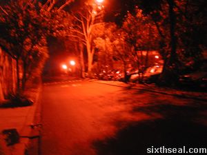
I had some stock photos of reddish moons during sunsets on polluted
days, but what I finally settled for is something more common. The
banner is actually a picture I took yesterday night. It was taken
without flash and it’s a view of the road leading into the Operations
Office. You can see some trees and cars on the left, that’s the Farrer
Hall carpark. I used a Nikon 885 and the digicam is naturally very
enthusiastic about red colors so that’s why it came out with such a
reddish tint when taken without flash.

The original, unmodified picture taken @ 3 am 21/03/2003
I simply resized it without constraining the proportions, thus
squashing and stretching it and I liked the effect, so that’s my banner
from now on. I did not do any post production of any kind to the
original picture. I find that it fits the original sixthseal.com
significance, in that it nicely goes with the passage in the scripture
describing the sixth seal of the scroll judgments in Revelation. Going
back design wise to the essence of the domain is fitting, since
sixthseal.com’s first birthday is coming up. 🙂
Anyway, I’ll appreciate it if everyone could tell me their opinions
regarding this layout. Are there any errors or glitches when you view
the page? What do you think of the design? Love it? Hate it?
Indifferent? Comments and criticism regarding the layout will be very
much appreciated in the comments box. 🙂

Can’t say it’s not eye-catching
P/S – The new POTD is submitted by veritas
[mailto:]. He feels that the previous one with the mummified possum is
slightly repulsive and he has given me a photo he took which he feels
will be much more appealing than the previous POTD. 🙂