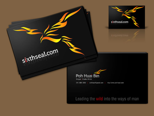
It has come to my attention that bloggers have started to pass out name cards. I seem to have lost touch with the blogosphere during my time in rehab coz I didn’t even know that was going on. It’s a vanity thing but I got a friend of mine who’s really good in design to do one for me. Heh!

Front

Back #1

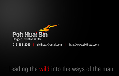
Back #2
I’m not sure which one looks better? Does the “Poh Huai Bin” with caps or the “poh huai bin” without caps look nicer? Comments are appreciated.
I’m going to run a limited 100 pieces print using a standard laser printer coz the KL printers won’t be able to produce them in time for the really good quality ones. The local printers are charging me RM 40 for the 100 pieces run. I’m going to get them printed from KL using four color offset printing with double sided matte lamination and spot UV on 260 gsm art card for only about RM 62 for 200 pieces.
Does anyone have a better deal? I’m looking for high quality printed name cards. Feedback about the back portion of the card would be appreciated. Cheers!
Poh Huai Bin
without caps.
i have a name card for my blog. rather simple one. but only because i don’t want to give out my company name card. not related mah
“Poh Huai Bin” looks nicer.
=)
the name card looks great!
OMG!!! Damn nice your name card! Your friend is seriously professional. Go for Poh Huai Bin!
I prefer the one with caps. Nice design btw.
No caps please HB, it looks awesome!
No caps please HB, it looks awesome!
Hi. Our company is now offering 12cents a piece for a minimum order of 1200pcs. The specification is the same as what you’ve stated above. 2 sided Full colour, Spot UV, Matt Lamination, and a maximum of 6 different names printed on a single design. For more information, you can reach us at http://www.treblefun.com/Treblefun/Contact.html
Thanks.
Oooo…so nice! I want! I want!…I like without caps PLUS “blogger” and “creative writer” too!!! U asked that shop at Wisma Sanya…one of the upper floors? I understand they’re cheaper than the regular printers.
I would prefer without caps,web address first follow by email address and phone number
this rocks.. very neat.. i am tempted to have one now… you design by yourself?
With caps!
Agree with Philip! There’s another pro there HB! 😛
I prefer the one without caps, I’d go for blogger | creative writer without caps too.
I’d possibly have the URL on a line on it’s own then the email address followed by the number on a new line.
The one with caps look better 🙂
with no caps one look better
with caps! after all its a name.. and your name! =) and it looks awesome! very unique design. thumbs up!
Listen to some of this excellent shit!!!
Panda Head Curry?
http://www.disarseter.com/PHC
Without caps look nice. That’s a really sweet looking design.
I got some made, but mine’s very simple and straightforward.
Dude, I love the devils’ horn..totally rock n roll. No cap, because you are a rebel who does follow the rules!
Lets make some sixthseal’s T-shirt, can find you a high quality T-shirt printer here.
With all the talk of the specifics of business cards, anyone else reminded of American Psycho?
wow! really professional work
i vote for caps
That’s a great design. The colours especially. I’d say go with the caps. To me, that feels bold. Makes a statement. 🙂
the logo looks absolutely fantastic! (great for a tattoo too)
get the one with the small letters. more consistency that way 🙂
Both look fine, though I think the small caps is a little more artistic. I would add a small discrete “666” logo somewhere. If you are going to hell, you may as well go in style. I plan on riding a flaming surfboard straight into the gates of hell.
– D
poh huai bin = looks like a store’s name
Poh Huai Bin = suits u. A Pro Blogger’s card.
that’s what my eyes told me so.
oh, btw is dat an eagle or a phoenix? 😀
actually i much prefer a mini print size from http://www.moo.com/
you might want to check it out.
Both are good, but lower case does look cooler I reckon. Also get some Tshirts and Caps done for yourself when you go on photoshoots with sixthseal.com on them.
I’d go for the version with caps it has a more serious look too me. Good design tho really like it.
I like it with caps. The comments seem about evenly split.
Great blog, BTW. Long time reader (since the the early days of the “original” sixthseal.com), first time comment.
Be aware you have fans in New York, USA…Keep it up.
Ooh, ooh, send me one!
Pretty please?
H.
That is a sweet design. I like the one WITH caps.
*eating Oreos*
I prefer it without caps. It looks much better.
Poh Huai Bin, simply because I like to call you PHB or HB. 😛 Your friend simply brings out the real you in your name card. Great work!
Fire phoenix with devil’s horn… black card yet with fiery red accent! Gosh! Everything to describe you. The red “i” is so you!
Reserve one for me please~~~ Muak!
Go for the without cap. it look nice without the cap =D
wah your friend really pro….it’s really look great!
Prefer the one WITHOUT cap. Reserve 1 card for me, thanks….
Awesome design! I love the phoenix artwork. I can’t decide whether caps or no caps looks better though, so I guess I’ll just side with the majority which seems to be no caps right now =)
woow that is an awesome design! i prefer the back no 1 with the caps. It seems that the KL supplier has a better deal than the local one so stick with the KL one first until u get a better deal.
the one with CAPS are much better ~ !!! ^^
Caps. Definitely.
woahH!!! It’s SO NICE!!! Love the fiery bird =P
I think you should definitely go for ‘no caps’ ‘cos it’ll match with your ‘sixthseal.com’ logo (back of card), plus the caps are so typical, boring, corporate business card style… no caps is more fun, funky, young & cool! =D
I think Back #1. For something, like name, should alwasy has a standard (Capital for the 1st letter) … like Sarawak is much better than sarawak. I think it is a kind of respect.
“poh huai bin” without caps look nicer. it’s not something very formal, in a way and for me, i don’t want to associate myself with the typical corporate business ‘rules and guidelines’ say ‘name must be written in capital letters’. you are kinda rebellious right? haha! and since you are not asking about which one more appropriate but which one is nicer, the one without caps definitely looks nicer! it matches the sixthseal.com or else you put SixthSeal.com haha! (fuh that’s a long comment)
then, i will prefer to put web address first, then email and phone number in the order.
ps: spare one card for me 😀
OMG! I’m so confused now. I don’t even know which one to choose with all the conflicting reports.
rachel: I liked this one better initially too but the designer told me the benefits of having it in small caps.
suanie: Yeah, it looks more informal and somewhat more attractive. I just realized bloggers have name cards after I saw Nicole’s name card. I found that rather nice and decided to get one done.
It’s true, it’s a little bit strange to give out the company name card.
Firdauz: It looks neater with caps. The comments are about split equally both ways.
shun2u: Thanks to my designer friend. It’s really amazing, the stuff he can do!
Secret Admire: Yeah, this guy is seriously professional, not POHfesssional. 😉
Poh Huai Bin was the one I liked better but after his explaination, I kinda like poh huai bin too.
p-t: Yeah, the design is great. I originally wanted my phoenix tattoo on it, but now I think this one looks better since it’s more abstract. 🙂
JoeNiece: I think I’ll just do a batch with caps and a batch without caps.
Shinky: Thanks, I got your email. I will finalize the design and confirm with you.
suituapui: I want Sheraton. 😉 He’s really good in design, this friend of mine. Excellant work. I wanted to put Travel Writer but decided to settle for Creative Writer.
No, I asked at a shop in the new bus terminal. I already went after work yesterday and will be picking it up after work today.
Philip Hii: URL first? Hmm…but then again, the URL is already huge on the front part of the card so it’s not really necessary. I kinda like the phone number first thing. 🙂
clementwpy: Of course not! My design skillz are legendary – coz I have NONE. I’m probably the WORST designer in the entire world. It’s my friend who did the design for me.
xes: Looks neater, huh?
Clare: Poh Huai Bin with caps? You just said that twice in the comments. 😉
Haha!
ShaolinTiger: Hmm…I haven’t thought of that. Yeah, if we’re going without caps then the titles should be without caps too for consistency right? I’m interested to see how that looks like. Will speak to my designer before I send the proper batch to the KL printers. I’m interested in doing plastic name cards too, I wonder who can do that kind of thing in Malaysia. Must cost a fortune though.
racoon: It looks neater, that’s for sure.
(=’.’=): Without caps looks more artistic. I’m starting to like without caps better since I got to know this design friend of mine.
chrissy0308: Thanks for my design friend. All credit goes to him. He won’t even accept payment from me!
cipap: Yeah, I’ve seen that before. 🙂
Gette: Yeah, I wondered when the trend of blogger name cards started coming out…never heard of it before I went to rehab. Yours look nice too. 🙂
e: Yeah! It was his idea, I just gave him a very rough draft of what I wanted. Everything else added in was his work. Thanks for the feedback.
I’ve been meaning to make some sixthseal.com t-shirts for a very, very long time but never got around to doing it.
anon: Heh! I was wondering when someone would bring that movie up. I remember that movie, snorting cocaine and comparing business cards. Showing off their ivory, platinum and heavy card stock business cards and getting a psychotic fit over it. 🙂
neurol23: Yeah, the artwork is very nice indeed, eh? I love the phoenix design.
expressionless: Total caps as in POH HUAI BIN? I haven’t tried that yet, will see how it comes out.
IcedNyior: Yeah, but I already have a phoenix tattoo so I can’t go for this one. 🙂
David: Indeed, that’s what my designer friend told me too. 666 logo sounds good too but it’ll be really small and unless that’s my car plate number (which I was actually bidding for when I got the Vios) I wouldn’t do it. Haha! Yeah, if we’re heading down there anyway, there’s nothing wrong with going down with style. 😉
Cokelatrawkz: It’s a phoenix la. I have a phoenix tattoo on me so there’s the association there. The phoenix also symbolizes rebirth which I can associate with, with my ex-lifestyle and all that.
Tanco: Hmm…I wanted it to be a standard business card or credit card sized one. I always misplace the odd shaped cards. 🙂
Jeff: Yeah it looks more modern in a sense and less uptight. I’ve been planning the t shirt thing for a very long time, but never got around to doing it.
MI!: Yeah, I’m still pondering the pros and cons of serious vs more modern.
Ken D.: Yeah, it’s about even down the middle. Different strokes for different folks I guess. 🙂
Thanks for reading, my friend. Cheers!
henry the thirst: Sure, as soon as the good quality ones come out in 10-15 days. I’m doing a smaller quantity lower quality one first coz the good quality ones can’t be made in time. Email me your mailing address.
eve: I like the one with caps in the beginning too, now I’m not so sure. I like both.
The Bull: Yeah, it looks more informal. 🙂
fish fish: Yeah, I loved it the moment I saw the mockup. The horns replacing the dotted i and the red i in sixthseal.com and the color coordination in wild. He’s really good.
Definately reserved one for you. I’ll be giving you the good quality ones when I get them printed.
nkwai: Yeah, he’s really good in design. I have much respect for him.
sylvia: No problem. Email me your mailing address.
ZS: I like both and now I’ve gotta think about whether the blogger and creative writer part should be all in small caps. Jesus…
Darren: Yeah, KL supplier has a better deal AND a better quality too. I just gotta make a small print run first though.
Honghongtan: Noted! I shall take it into consideration. Cheers!
;): Okay, the first batch is printed with caps. I wanted to seek comments for the actual high quality print runs from KL. I’m thinking of even doing a limited 100 pcs plastic card run. OMG! I’m turning so vain. 😉
yanz: The Rise of the Phoenix! 🙂
Yeah, I get what you mean, that’s what my designer friend told me too.
AhSeng: Hmm…true, but there’s a trend towards no caps nowadays.
bongkersz: Yeah, that’s what I was informed of too – informal, friendly. 🙂
Yeah, if I went for caps I would have to go SixthSeal.com too eh, which is NOT the way I spell the blog name. 🙂
One card for you, no worries. Pass it to you when I see you.
Without caps, more feel and more sensual. Just like your dick, you say with condom better or without better? Huh? Huh?
If you decide to go for with caps, can also but I suggest conbine the 2 name or even all as “Poh HuaiBin” or “PohHuaiBin”. Unique n creative also.
haha.. nah, I meant Poh Huai Bin. All caps will make it look shouty. Looks like it’s somehow 50/50 eh? Tough choice for u. 😆
All lower case letters looks better. Listen to me cuz I am right! Matches the url name. Is that a phoenix? Nice, but what has it got to do with ‘sixth seal’? And btw what is sixth seal and where and how did the name come about?
i too think that without the caps looks nicer. btw, your namecards look really cool.
Wilson: Very good analogy. 😉 I have lately been unable to maintain an erection perhaps due to my escalating high blood pressure. Hmm…perhaps that’s too much information for the blog. 😉
Thanks for the feedback about sticking the two first names together. I didn’t want to do that coz some people really have two first names spelled back to back e.g. ChengXi. That’s not how my name is spelled though, so I didn’t want to go down that line.
expressionless: Yeah, I think I’m gonna settle for no caps and do a less cluttered version with more spacing. I’ve gotten the first locally produced batch already.
Pixeldoll: Yeah, that’s the one I’m settling with. All lower case.
Anyway, that’s a phoenix. I have a phoenix tattoo on my chest, it symbolizes rebirth. I used to have a problem with drugs and alcohol. This signifies my return to soberiety (kinda).
The name sixthseal.com comes from The Book of Revelation in the Bible. It’s one of the seal judgements, the sixth one.
xin: Yup, I’m going to do it without caps. 🙂
Cheers! My friend did the design so all credit goes to him. 🙂
Wow! They look great! I love the phoenix it adds a personal dimension to them.
Go with the caps, looks heaps better and makes them look more professional and in charge!
what a nice name card you got. =)
very creative indeed ^_^
Tom: Cheers buddy! 🙂
I’m now thinking about going with the caps ever since I saw Nicole’s card. It looks more professional.
xiang: Thanks mate!
Archie: Yeah, all credit goes to the designer friend of mine. 🙂
I also have a blogger + company namecard(black & white).
Then if hv time, would like to make a new one “pure” blogger namecard.
Hi
The one with caps looks nicer.just my opinion.=)
Anyway i am looking for a designer to design a name card for me.Can u give me the contact of the designer if you dont mind? Anyway its really a great namecard..one of the best ive seen so far.
Cheers!
chazzz: Yeah, it seems to be all the rage now. I wonder if Mahathir has a blogger name card. 😉
DomainDotMy: Thanks for the feedback. I will ask him to email you if he’s up to it. Cheers!
Thank you for your reply. =)
Hope to get his email soon n perhaps a quotation on how much does he charge to design a namecard wud be good.thks
Hello,
Can I shamelessly have a copy of your business card? I live in the US and would love to make one for myself. I promise I will change the name and if anybody asks who/where it came from I will mention both your friend and your blog!
DomainDotMy: Have you recieved a reply?
Matthew: Sure, email me your mailing address and I’ll send you one. 🙂
Hi there…the card looks great. Does your friends or any of his friend doing freelance?
If yes, appreciate he can list his profile at mydesigners.my to help Malaysian design industry.
Thanks,
Dave